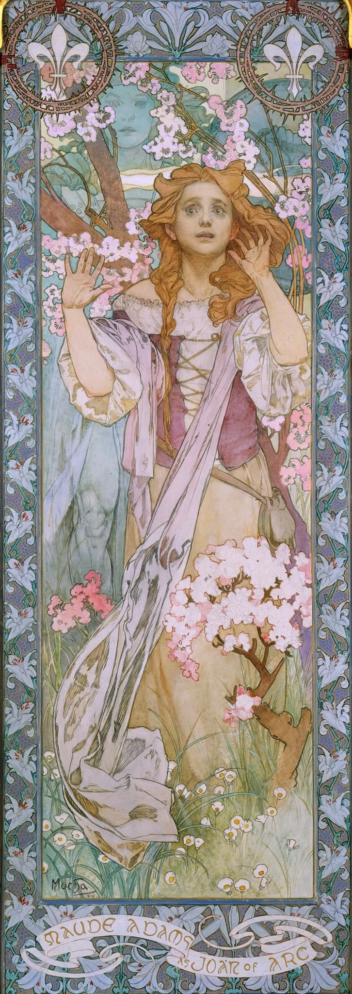
Art Nouveau never settled into a single look, and that refusal is the most interesting thing about it. We tend to picture one image: a woman's hair dissolving into vines, a doorway that seems to have grown rather than been built, a poster where the lettering bends like a stem. But the style that carried those images was less a fixed vocabulary than a set of instructions, a grammar of the organic line that any workshop could pick up and run through its own habits. It moved fast, by magazine and exhibition and shop window, and it changed at every stop. The version you remember is almost certainly a local dialect that happened to travel well.
The argument of this essay is narrow on purpose. The history of Art Nouveau worth telling is not its birth in any one city but its behaviour in transit. One governing idea, that line should carry structure and ornament at the same time, came out differently in Paris than in Vienna, and differently again in The Hague and across the Atlantic. Watch the curve travel and you watch a movement think out loud, revising itself against local taste, local materials, and local money. The masterpieces of the style are the places where its portable method collided with a stubborn local hand and produced something the method alone could not have predicted.
A grammar built for export
The name arrived before most of the work it would describe. On 26 December 1895 the Franco-German dealer Siegfried Bing opened a gallery at 22 rue de Provence in Paris and called it the Maison de l'Art Nouveau, the house of the new art, and the label fixed itself onto everything that rhymed with what he chose to show. A dealer's shopfront, not a manifesto, gave the movement its title. That origin matters, because it tells you the style was always partly a thing to be sold, packed, and shipped. Bing did not invent a doctrine. He assembled a stock, and the stock taught buyers what the new art was supposed to feel like.
Where did the line itself come from? The Metropolitan Museum's history of the movement traces it to older English currents, the Arts and Crafts movement and the Aesthetic movement, and to the flood of Japanese prints and objects that reached Western markets once trading rights with Japan were established in the 1860s. The Met's essay also points to a less obvious source, the new sciences of looking: the botanical and deep-sea plates of Ernst Haeckel's Art Forms in Nature of 1899, where the natural world arrived already styled into pattern, every radiolarian and orchid pressed into symmetry. The whiplash curve was partly an act of observation, copied from a microscope slide as much as invented at a drawing board. Designers were not only drawing flowers. They were drawing the way a magnifying lens had taught them to see flowers, edited and balanced before the pen ever touched the paper.
Tate's definition is worth holding onto for its plainness: an international style in architecture and design, emerging in the 1890s, built on sinuous lines and flowing organic shapes drawn from plant forms, and carried to a wide public by the Exposition Universelle in Paris in 1900. That description is broad on purpose, because the thing it describes declined to stay national. The line was the export. Everything else, the material, the function, the meaning, was negotiable at the destination.
How did a grammar travel that fast? It rode the period's new machinery of attention. The Paris exposition of 1900 put the style in front of an enormous public in a single season, and the illustrated press did the rest, reproducing a staircase from one city or a tea room from another for readers who would never see either in the flesh. A designer in one country could study a drawing made in another within weeks of its appearance. The line did not need an academy or a treatise to spread. It needed a printing press and a shop with a good window, and the decade handed it both. Speed of that kind has a cost. A method that propagates faster than any school can police it will fork, and Art Nouveau forked at every border it crossed.
Paris: the line goes outdoors
Paris took the curve and put it in the street. Around 1900 Hector Guimard designed close to a hundred cast-iron entrances for the new Métropolitain, their paint a green chosen to imitate patinated bronze, their lamp-stalks rising over the stairs like budding plants pushing up through pavement. Smarthistory's account underlines how strange a gesture this was: the most advanced decorative idiom of the day applied not to a private salon but to public infrastructure, the subway treated as a garden gate. Each frame repeats one idea, two stalks of iron curling up to hold a glass canopy or an amber lamp, the metal swelling at its joints the way a stem thickens at a node. Nothing about the shape announces that it is the mouth of a railway. Guimard let the function hide inside the plant. This was the Parisian move in its purest form. The organic line went democratic and outdoor, a luxury vocabulary handed to commuters by the thousand.
The same instinct ran through the city's printed art, and nobody pressed it harder than the Czech painter Alphonse Mucha (1860-1939), who built a career in Paris turning theatrical advertising into something close to devotional imagery. His posters taught a whole generation how to read a curve as glamour. What is easy to forget is that the poster habit followed him onto the canvas and across the ocean. The discipline he learned at the lithographer's stone, the flattened space, the figure pinned to the foreground, the ornament that organizes everything behind it, did not switch off when he reached for oil paint.
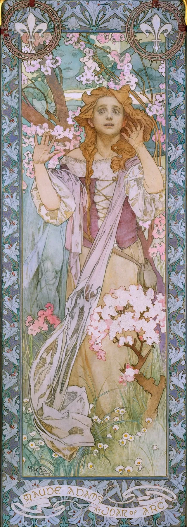
Mucha painted Maude Adams as Joan of Arc for the American actress who was about to take the part on a New York stage, and the canvas shows how completely his Paris grammar had soaked into his painting. Adams stands in armor, head tipped back and up, her face caught in a cold pale light that the surrounding dark refuses to share. Behind her Mucha sets the device that runs through all his work, a great shallow arc, half halo and half stage flat, which pushes the figure forward and squeezes the depth out of the space she stands in. The crowd and the torches behind her are not deep. They are pattern, a dim warm texture against which the silver figure reads. Look at what the line is doing. Her banner and her hair and the folds of cloth at her feet are all bent into the same slow curve, so that a religious vision and a piece of theatrical promotion become one continuous gesture. This is the Paris manner at full stretch: ornament and meaning carried by a single contour, the sacred handled with the tools of the billboard, and the whole thing shipped to Broadway.
That last point is the one to hold. The Parisian achievement was not the prettiness of the curve. It was the willingness to put the curve where curves did not belong, on a transit railing, on a wall poster six feet tall, on a canvas meant to advertise a play. The line earned its keep by being public, and being public is what carried it abroad in the first place.
Vienna: the curve turns to contour and gold
Vienna received the same grammar and pulled it toward the flat and the precious. In the hands of Gustav Klimt, the organic line stopped imitating growing things and became a way of organizing a surface. Look at Serena Pulitzer Lederer. Klimt sets the sitter in a high, pale haze, the dress dissolving upward into a ground of nearly the same value, so that only the face and the hands keep their edges. The brushwork thins as it rises, the pigment scrubbed so dry near the top that the weave of the canvas shows through, and the sitter seems to be evaporating into the wall behind her. He keeps the face crisp and lets the rest go deliberately unfinished, a portrait that argues the social self is mostly atmosphere. The whiplash curve survives, but it has gone quiet and vertical, a matter of contour rather than vegetation. Where Paris let the line run riot in iron and ink, Vienna brought it back indoors, into the portrait and the decorated panel, and made it carry social standing. The Parisian line shouts from a wall; the Viennese line whispers across a drawing room.
Central European ambition for the style was total. The unit of design was the room, not the object. Gyula Benczúr's Project for a Room for King Ludwig II of Bavaria belongs to the older dream of the wholly designed interior that Art Nouveau inherited and then pushed to its edge: the conviction that wall, furniture, light, and figure should be composed as one continuous thought. Ludwig's fantastical commissions sit just upstream of the movement, and they explain its appetite. Once you believe a room can be a single artwork, the line that knits a chair to a window frame to a ceiling fresco becomes the most important tool you own. The curve was not decoration added at the end. It was the joinery that held the whole interior together, the thread that let a designer treat a room as one drawing rather than a heap of furnishings.
The Hague and the pull toward abstraction
The further the line traveled, the more abstract it was willing to become. In the Netherlands the local strain went by Nieuwe Kunst, the new art in Dutch, and its decisive move was to drop the recognizable flower altogether. Theo Colenbrander's garniture of five vases of 1886, made for the Rozenburg works in The Hague, already breaks ornament into pure floral rhythm, colour and shape set loose from any particular plant. You can read the surface as a meadow and never find a stem you could name. The Dutch took the organic principle and kept the energy while discarding the botany, which is one short step from the patterning that later abstract design would claim as its own.
The traffic that made all this possible was printed. The London periodical The Studio carried the newest work across borders month by month, and its volume for 1900, now digitized in full, shows designers from several countries reading one another in near real time. A movement that spread at the speed of a magazine could not help but fragment as it went. By the time the Dutch curve reached the page, it had already shed the literal blossom that a Paris poster still wore. Each reprinting was also a small act of translation, and the style grew more abstract the further it got from the hand that first drew it.
What 490 works tell us
Our own holdings give a useful, slightly awkward picture of how loose the label became. Artifact World Gallery keeps 490 works tagged Art Nouveau, made by 213 artists and held across 70 venues, with dates running from roughly 1606 to 1969. That span should bother you. Tate is clear that the style emerged in the 1890s and was effectively ended by the First World War, so a tag reaching back to the seventeenth century and forward to the late 1960s is not recording a period at all. It is recording an affinity, the long backward reach of the organic line into the decorative past and its forward reach into everything that later borrowed the manner. The fringe is where this shows most plainly. A portrait such as Margaret Rieche Richard by Dupuy, or Mary McLellan Hamilton's Pixie with its fairy subject, or the anonymous likeness of Lola Montez, sit inside the category by mood rather than by date. The Symbolist current runs close alongside the whole time; Odilon Redon shared the period's taste for the dreamed and the floral without ever carrying the movement's card. A style defined by a method, rather than a date or a place, will always have soft borders, and our catalogue is honest about that softness. The 70 venues are the other half of the lesson. A method that scattered across that many collections did so because it was never the property of one school or one country to begin with.
Works discussed in this article
Where it stopped, and what carried on
The end came quickly. Tate puts it without sentiment: the style flourished in the first years of the twentieth century and was killed off by the First World War. The handcraft economy that fed it, the dealers and small workshops and luxury commissions, did not survive the war's appetite for steel and standardization. What replaced the growing line was the machined one. Its geometric heir, Art Deco, kept the older movement's faith in total design while swapping the vine for the chevron and the orchid for the sunburst. The dreamier, inward strain folded back toward Symbolism and the broader decorative arts, where it had partly come from. Art Nouveau did not so much die as get redistributed, its method broken up and handed to its successors.
Hold the through-line in view and the movement reads as a single experiment run in many laboratories. The instruction was always the same, let the line do the structural and the decorative work at once, and the results diverged because the hands and the budgets diverged. Read the works in that order and the lesson is concrete rather than vague.
- Paris pushed the line outdoors and into print, public and reproducible.
- Vienna pulled it back indoors and made it carry status, flat and gilded.
- The Hague stripped away the recognizable plant and kept the rhythm, edging toward abstraction.
That is why the same label can stretch, in a single collection, from a seventeenth-century affinity to a 1960s echo without contradiction. The vine had been pressed into iron, gilded into portraiture, and printed onto a Broadway poster. When the war made it impossible for the line to keep growing, designers reached for the straight edge instead, and the curve went underground to wait for its next chance to travel. It got that chance, again and again, every time a later decade decided that the machine had grown cold and the eye wanted a stem to follow.
Sources & further reading
- Art Nouveau (Art Term) — Tate
- Art Nouveau — The Metropolitan Museum of Art
- Maison de l'Art Nouveau — Wikipedia
- Hector Guimard, Cité entrance, Métropolitain, Paris — Smarthistory
- Alphonse Marie Mucha (artist information) — National Gallery of Art
- The Studio: An Illustrated Magazine of Fine and Applied Art, 1900, Vol. 18 — Internet Archive