Shop by room, using scale and placement first.
Room paths help shoppers think about viewing distance, wall size, mood, and support needs before they commit to a work or print format.
Living Room
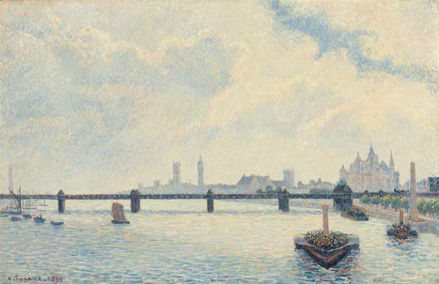
The living room is typically the largest uninterrupted wall surface in a home, which means scale mistakes are immediately visible. A print hung above a sofa should be roughly two-thirds the width of the furniture beneath it, with the centre of the work at eye level—about 145–155 cm from the floor. Consider viewing distance: a piece viewed from three metres away needs more visual weight than one seen from across a narrow hallway.
Landscapes with living-room scale
See all →






Bedroom
Bedrooms reward restraint. Choose quieter palettes and smaller scales than you would for a living room, and place the work where morning or evening light will not throw direct glare across the surface. Prints hung opposite the bed or beside a window tend to read better than those directly above the headboard, where reading-lamp reflections can obscure detail.
Quiet still lifes for a bedroom
See all →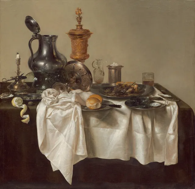




Office and Study
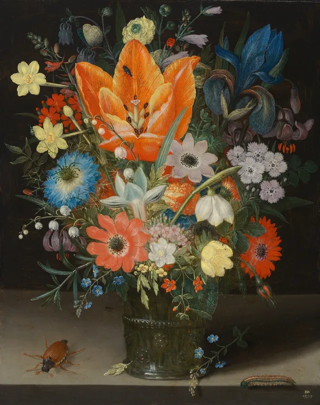
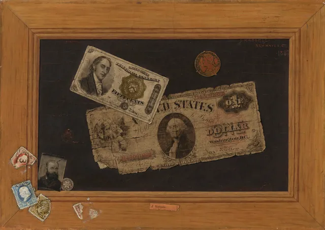
A study needs art that supports concentration rather than demanding it. Desk-scale pieces—roughly A3 or smaller—sit comfortably within peripheral vision without pulling focus from a monitor. Vertical formats work well on the narrow walls between bookcases or windows, while busier compositions should be kept away from the immediate workspace to reduce visual fatigue.
Horizontal landscapes for a study
See all →Dining and Kitchen
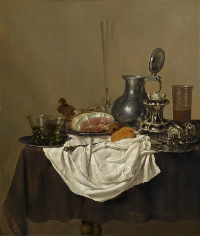
Dining rooms and kitchens are social, high-traffic spaces where prints act as conversation anchors rather than solitary statements. Grouping three to five smaller works above a sideboard creates rhythm at eye level when guests are seated. Near kitchens, avoid paper substrates that absorb moisture; instead, choose framed prints with acrylic glazing or metal finishes that tolerate humidity shifts.
Still lifes for a dining wall
See all →Nursery and Kids
Children’s rooms change quickly, so select imagery that is gentle enough for a nursery yet legible to a primary-school reader. Safety is non-negotiable: use secure wall anchors, avoid glass in favour of shatterproof acrylic, and hang works at a child’s eye level (90–110 cm) rather than adult height. Swap-friendly framing—clip frames or standard-size mounts—makes updates inexpensive.
Gentle marine scenes for a nursery
See all →




Gallery Wall
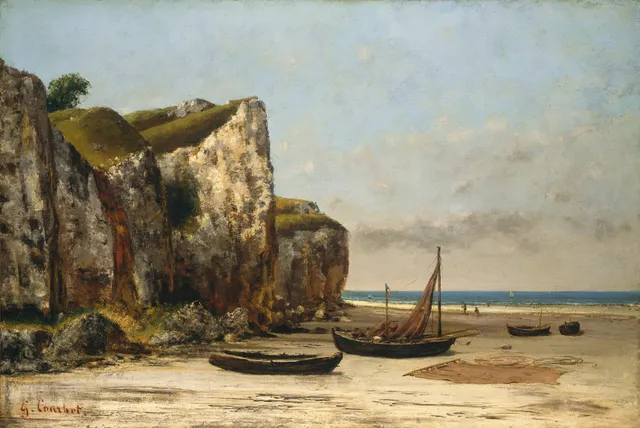
A gallery wall is a composition, not a collection. Start with one anchor piece—usually the largest—and build outward, maintaining 5–8 cm (2–3 in) between frames for visual breathing room. Either keep frames consistent in material and width, or mix deliberately across two finishes maximum. Trace each frame onto kraft paper, tape the templates to the wall, and live with the layout for a day before driving a single nail.
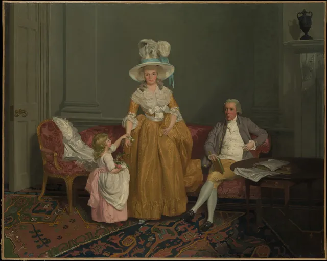
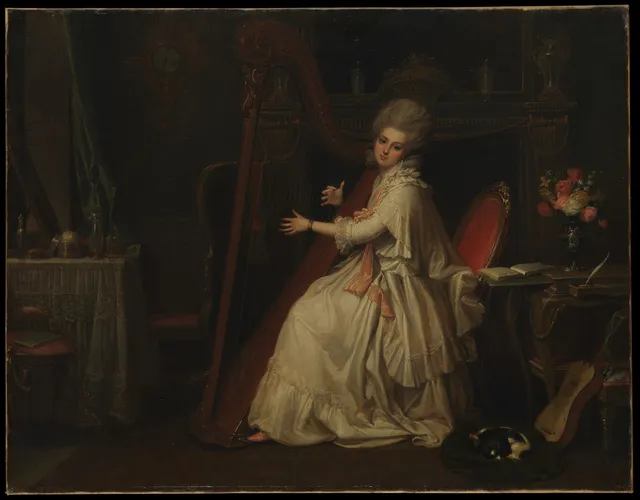
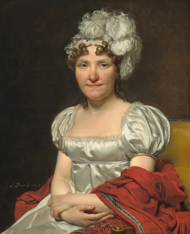
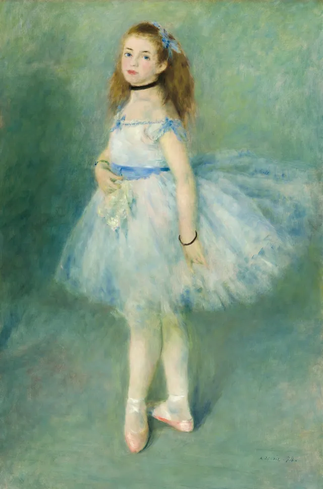
Portraits to anchor a gallery wall
See all →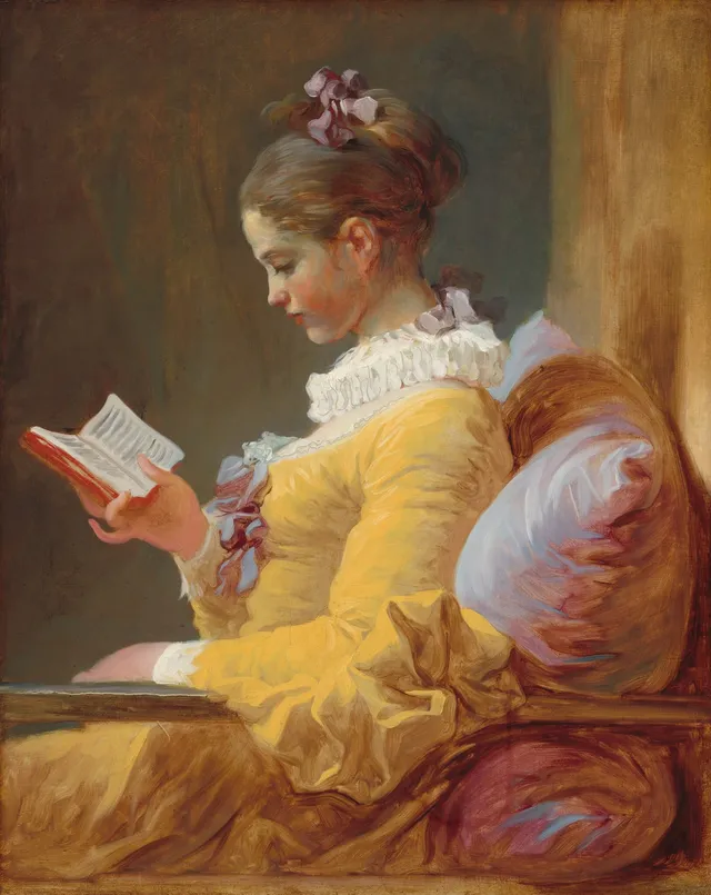


How to choose art for a room
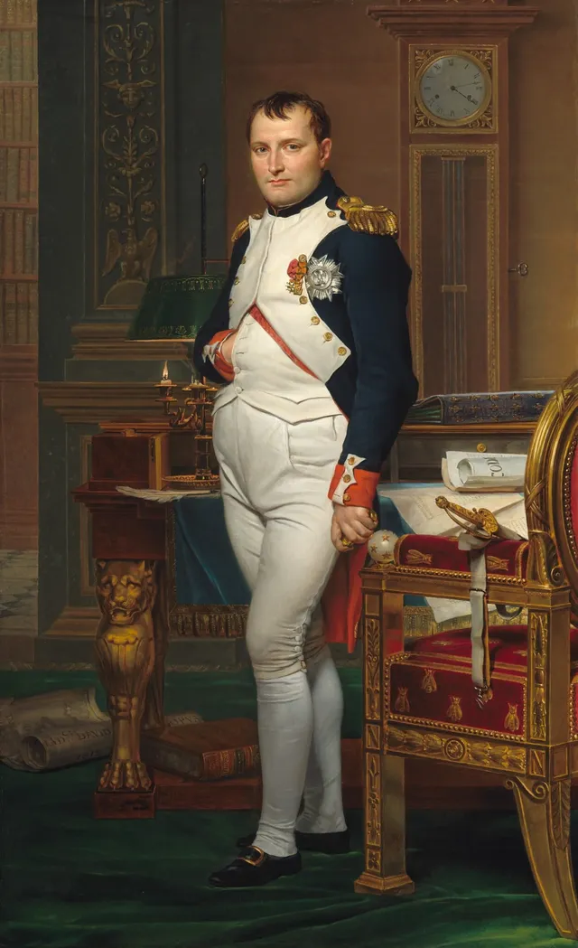
Begin with measurement. Measure the width of the wall or the furniture beneath the intended hanging spot; the art should occupy roughly two-thirds to three-quarters of that width. Then measure viewing distance: the diagonal of the print multiplied by two gives the minimum comfortable viewing distance in metres. A 60 cm diagonal print, for example, wants at least 1.2 metres of clearance before the viewer can absorb it without stepping back.
Next, match mood to function. A living room can carry bold colour and large scale because it is a space of arrival and gathering; a bedroom needs softer value ranges and lower saturation so the image does not compete with rest. In offices, prefer single-subject compositions or landscapes with horizontal rest lines that reduce cognitive load during long work sessions.
Finally, audit the light. North-facing rooms receive cooler, steadier light that shifts less across the day; south-facing rooms can bleach dyes over time unless prints are protected by UV-filtering acrylic. Track the sun path for a full afternoon before deciding exactly where to hang.
How to hang a set of three
A triptych or trio reads as one object, so hang it as one. Treat the group's outer edges as the frame: the whole set should still occupy two-thirds to three-quarters of the wall or furniture beneath it, centred at the same eye level you'd use for a single work. Keep an even gap between frames—about 5–8 cm for small prints, a little more as the prints grow—and align them on a shared horizontal axis so the centres, not the tops, sit level. Three identical sizes in matching frames is the safe, gallery-clean choice; a wider centre piece flanked by two narrower ones reads as more formal. If you want the set pre-curated, our gallery-wall sets are three prints chosen to hang together and ship in a single order.
Common mistakes
- Art too small for the wall. A 30 cm print on a 3-metre wall looks accidental, not minimal. Either increase the work size or group smaller pieces into a measured grid so the overall mass matches the architecture.
- Hung too high. The centre of the work should sit at average eye level—roughly 150 cm from the floor in living spaces, lower in children’s rooms. Hanging above door-frame height forces viewers to crane their necks and breaks the visual connection between the art and the furniture below.
- Ignoring light sources. Direct sunlight, downlights, and unshaded bedside lamps all create glare that obscures detail and accelerates fading. Test the exact hanging spot at multiple times of day before committing.
- Mixing frame styles without intent. Three different woods, a metallic slip, and a bare clip frame in the same sightline look like a yard sale unless the variation is part of a deliberate rhythm. Limit finishes to two, or use identical frames for everything in a single room.