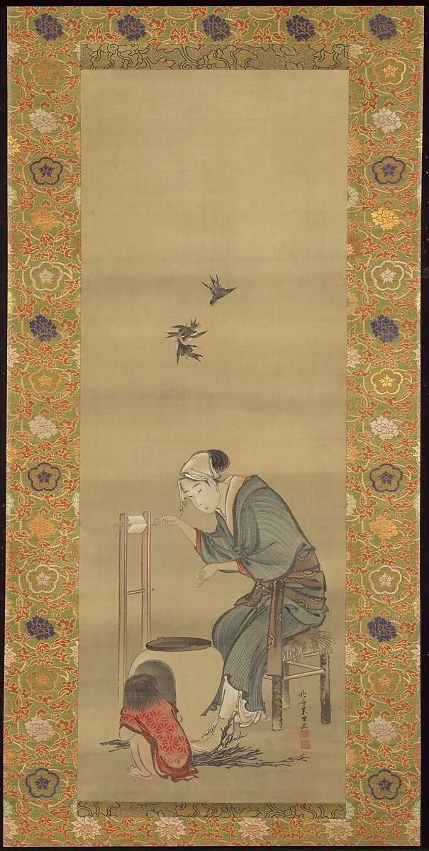
The quickest way to misread the Japonisme movement is to treat it as a shopping list of borrowed motifs: a paper fan tucked into a Parisian still life, a kimono thrown over a French model, a spray of cherry blossom along the margin of an oil painting. That reading is comfortable, and it is wrong. The fans and kimonos are the surface noise. The argument of this essay is narrower and, I think, more useful: what Japan actually exported to Europe and America between the 1860s and the First World War was not subject matter but a grammar of the picture plane. Japanese woodblock prints taught Western painters a different way to organize a flat surface, and once that lesson was absorbed it could not be un-learned. The motifs faded. The structure stayed.
So this is a piece about looking, not about cataloguing influence. I want to defend that claim through a single sheet by Katsushika Hokusai, the Japanese designer whose name became shorthand for the whole craze, and to show that one print contains, in miniature, every structural idea the West would spend forty years digesting. The term itself was a French invention. As the Tate glossary records, the critic Philippe Burty coined "Japonisme" in the early 1870s to name the Western appetite for Japanese art and design, and the word has carried a faint whiff of fashion ever since. Fashion it was. But underneath the fashion sat a real reorientation of how a painted image could behave.
A word for a craze, and the thing the word missed
The opening of Japan is usually dated to the 1850s, when the country relaxed the isolationist policy that had governed foreign contact for more than two centuries. The Getty frames Japonisme, literally "Japan-ism," as a European fashion for Japanese decorative objects that sprang up after Japan eased that isolation in 1853. Trade followed. So did a flood of cheap, beautifully printed paper. Ukiyo-e prints arrived in Europe partly as packing material, wrapped around porcelain and lacquerware, and the story of dealers and painters smoothing out those creased sheets is repeated so often because it is true and because it captures something exact about the moment. The art came in sideways. Nobody had decided in advance that it mattered. It mattered anyway.
The public moment came in 1867. At the International Exposition in Paris, Japan mounted a pavilion, and Smarthistory describes that fair as the first mass introduction of Japanese culture to a Western audience, with Hokusai's work among what was shown. The collecting craze followed quickly. Dealers built businesses on it. Painters built studios around it. What is easy to forget is how strange these images looked to an eye trained on the Renaissance. European pictorial logic since the fifteenth century had been built on a window: a single vanishing point, a measured recession into depth, light modeled in continuous gradation. The Japanese print proposed almost the opposite, and proposed it without apology.
Here it helps to be precise about what "opposite" means, because the differences are not stylistic preferences. They are structural decisions. A print might place the horizon high, near the top of the sheet, so the ground tilts up toward the viewer rather than receding away. It might crop a figure hard at the edge, letting an arm or a tree trunk run off the page as if the world continued past the frame. It might leave large fields of flat, unmodulated color and then trust a single calligraphic line to do the work of describing form. It might refuse symmetry entirely and balance a heavy mass on one side against a near-empty void on the other. Each of these was a live problem for European painting, and the print solved all of them at once, casually, as ordinary craft.
The single sheet: looking at a Hokusai
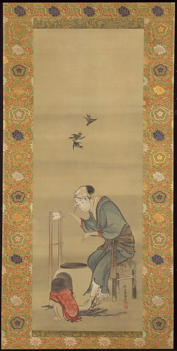
Stand in front of this untitled Hokusai sheet and the first thing to register is the line. It does not search. A European drawing of the same period would feel for a contour with many short strokes, hatching the shadow, building volume by accumulation. Hokusai sets a single long line and commits to it. The brush swells where pressure increases and thins to a hair where it lifts, so the contour carries weight and speed inside itself. The edge of a form is not where modeling stops. The edge is the statement. You can see the hand move. You can almost time it.
Then notice what the sheet refuses to do. There is no atmospheric haze softening the distance, no consistent cast shadow anchoring the forms to a floor. Space is declared by overlap and by placement on the page, not by perspective math. A shape nearer the top reads as farther back, and that is the entire depth system. The composition is weighted off-center, with the mass pushed toward one side and the opposite quarter of the sheet left open. That openness is not laziness or unfinished work. It is a positive element, as deliberate as anything drawn, and it holds the design in tension the way a held breath holds a phrase. European painters looking at this would have understood, slowly, that empty paper could be made to carry meaning.
The color, where it appears in Hokusai's printed work, behaves the same way. It arrives in flat, bounded zones rather than continuous gradients. A blue is a blue across its whole field, sitting inside its contour like water inside a bowl, and the drama comes from how one flat field meets another, not from shading within either. This is the quality that would detonate inside French painting two decades later, when a generation tired of describing the play of light on surfaces went looking for a way to make color structural again. The print had been doing it the whole time.
Hokusai is also worth dwelling on because he wrote about his own practice, and his instructional books circulated as objects of study. The gallery holds his Picture Book in the Katsushika Style (Ehon Katsushika-buri), the kind of volume that let a Western artist watch a master break the visible world into repeatable marks. A picture book like this is a teaching machine. It shows a wave, a bird, a wrestler, a bridge, each reduced to the fewest decisions that will still read as itself. For a Paris or London painter who could not read a word of the captions, the lesson came through anyway, because the lesson was visual: form is a set of choices, and you can show your choices on the page.
What Europe actually took
Trace the influence forward and the structural reading holds up better than the motif reading. Claude Monet owned a large collection of Japanese prints, hung them on his walls at Giverny, and built a water garden whose famous bridge owes its profile to the print culture he loved. But the deeper debt is not the bridge. It is the willingness to let a surface become a field, to push the horizon up until the water fills the canvas and the lily pads float as flat shapes on a flat plane. The pond paintings are the most Japanese thing Monet ever did, and they contain not a single Japanese object.
Vincent van Gogh is the clearest case, because he left a paper trail. The Rijksmuseum notes that he did more than copy Japanese woodcuts; he adopted their style to modernize his own painting, taking on the high elevated horizon, the hard contour line, and the abrupt cropping. Look at how he frames a tree trunk slicing the foreground, or how a field tips up toward the picture's top edge. Those are not Provençal observations. They are Hokusai's compositional moves, relocated to the south of France and rendered in thick paint. Van Gogh understood that the print offered a way out of the brown, recessive interior of European tradition and into something bright, frontal, and flat.
The Belgian painter Alfred Stevens sits at the more decorative end of the spectrum, painting fashionable women among Japanese fans and screens. His work is sometimes dismissed as mere taste, and there is justice in that. Yet even in Stevens the new grammar leaks through, in the way a screen flattens the back of a room into a patterned plane, or a fan becomes a bold geometric shape interrupting an otherwise conventional space. The motif and the structure arrive together in painters like him, which is exactly why his pictures are useful: they let you watch a Western artist using the props before fully grasping the lesson the props were teaching.
This is where our own holdings sharpen the picture. Artifact World Gallery keeps 315 Japonisme works spread across 12 venues and made by 26 artists, with dates running from roughly 1749 to 1918. Set that range against the standard account and the asymmetry is instructive. The conventional story treats Japonisme as a European event of the 1870s onward, fashionable in Europe after the 1867 Paris fair and, as the National Gallery of Art documents, cresting in the United States across the 1880s and 1890s, including at the 1893 World's Columbian Exposition in Chicago. Yet the earliest dates in our cluster reach back into the mid-eighteenth century, because the cluster correctly includes the Japanese source prints themselves, not only the Western responses to them. The corpus, in other words, keeps the cause and the effect in the same room. That is the honest way to file Japonisme: a conversation, with both speakers present.
Works discussed in this article
Beyond the print: the decorative reach
Japonisme did not stay on paper or canvas. It moved into objects, and the move clarifies what was really being imitated. Consider Peter Carl Fabergé, the St. Petersburg goldsmith whose workshop produced hardstone carvings of animals modeled directly on Japanese netsuke, the small toggles carved to fasten a cord on traditional dress. The netsuke taught Fabergé's carvers an aesthetic of compression: how to give a crouching animal its whole character in a form that fits the palm, how to find the gesture that makes a hare or a toad legible without a single superfluous detail. That is the print's economy translated into three dimensions and precious stone. The discipline is identical. Say the most with the least, and let the material show through.
The traffic also ran the other way, and that matters for fairness. Kōno Bairei, a Kyoto painter and teacher active in the Meiji decades, worked at exactly the moment Japan was absorbing Western art even as the West absorbed Japanese art. His bird-and-flower studies sit on the seam. They keep the brushed line and the asymmetric placement of classical Japanese painting while quietly registering an awareness of a new, international audience for Japanese imagery. Japonisme was never a one-way export of exotic goods to hungry Europeans. It was a mutual disturbance, and artists on the Japanese side were neither passive nor unaware of how their tradition was being read abroad.
The American painter Robert Frederick Blum closes the loop by going to the source. Blum traveled to Japan in the early 1890s and painted what he saw there directly, rather than working from imported prints in a Cincinnati or New York studio. His Japanese pictures are a useful control case, because they let you separate two things that usually blur together: the depiction of Japan as a subject, and the adoption of Japanese pictorial structure as a method. Blum, standing in a Tokyo street, mostly did the former. The structural revolution, ironically, ran deepest in painters who never left Europe and only ever knew Japan through a stack of secondhand prints.
Why one work can carry it
Return, finally, to the single Hokusai sheet, because the case for close-looking rests on it. A survey of Japonisme can list a dozen artists, six countries, and forty years, and still leave you knowing nothing about why the prints mattered. The list is the least interesting thing about the movement. What matters is the moment a painter's eye snags on a contour that does too much work, on a void that refuses to be filled, on a horizon shoved up where no academy would allow it, and feels the old rules loosen. That moment is reproducible. You can have it now, in front of one sheet, the same way Monet and van Gogh had it in front of theirs.
There is a second sheet worth setting beside the first. Compare the hero against this other untitled Hokusai page and the consistency of method jumps out. Different subject, same intelligence: the line still carries the weight, the page is still balanced against an opening rather than filled corner to corner, the forms are still declared by edge instead of built by shadow. Two pages, one grammar. That grammar is the actual cargo that crossed the ocean, and once you can read it you stop needing the fans and the kimonos to tell you what you are looking at.
The longer reach of this lesson runs straight through to the painting that followed. The flatness, the bold contour, and the decorative confidence that the prints handed to Impressionism were carried further by the Post-Impressionists and then by everything that depended on the picture as a designed surface rather than a window. When a modern painter treats the canvas as a flat thing to be organized, and not a hole to be looked through, that habit has a genealogy, and a long stretch of it runs back through a stack of creased prints that arrived in Europe as wrapping paper.
Sources & further reading
- Japonisme — Tate
- Japonisme — Smarthistory
- What Are Japanese and Chinese Objects Doing in This French Aristocrat's Bedroom? — The J. Paul Getty Museum
- Vincent van Gogh and Japanese prints — Rijksmuseum
- Japonisme — Wikipedia
- Japonisme (Heilbrunn Timeline of Art History) — The Metropolitan Museum of Art
- Young Woman in a Kimono, c. 1901 — National Gallery of Art
- Artistic Japan, illustrated (Le Japon artistique), ed. Siegfried Bing — Internet Archive