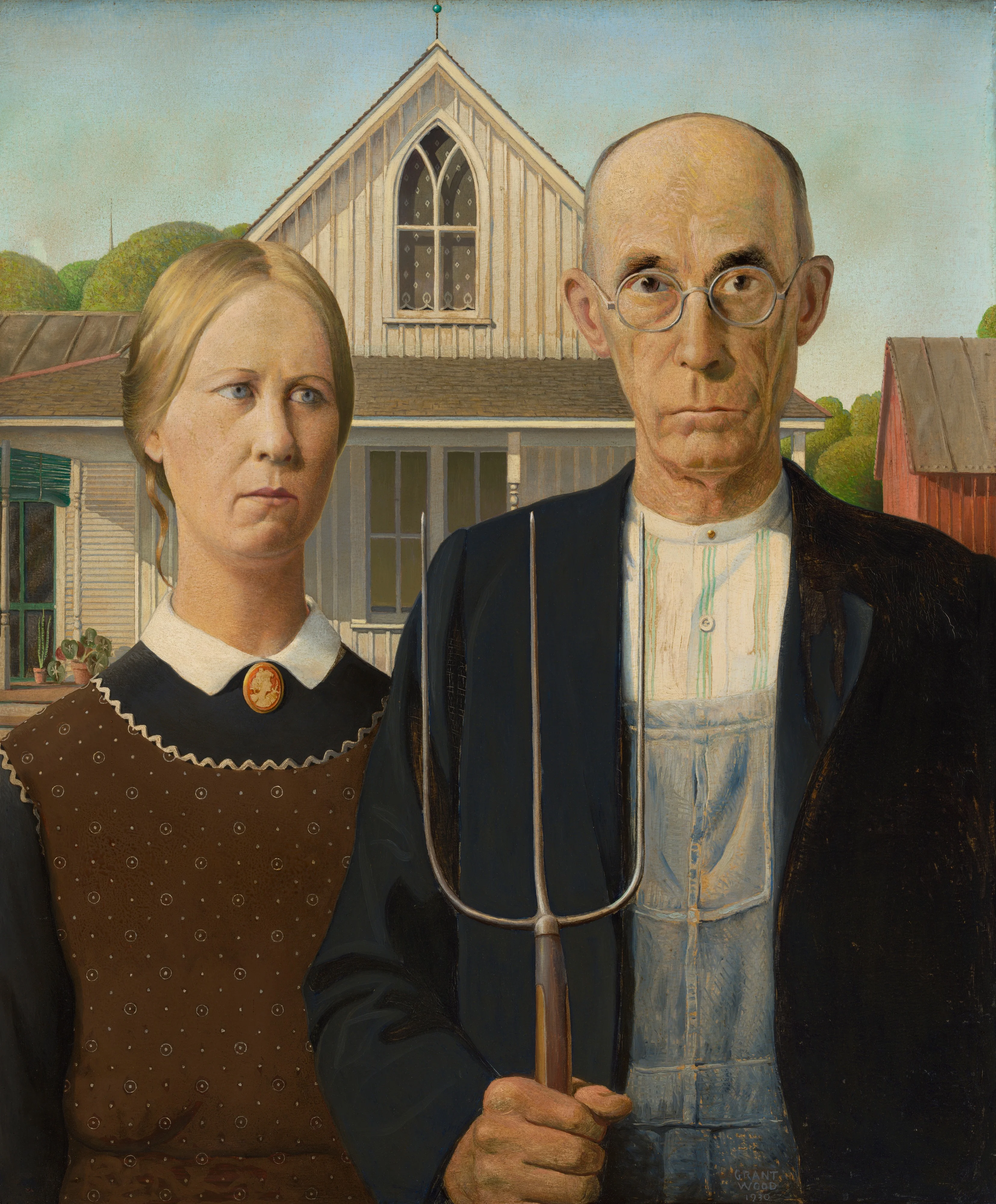
The Art Institute of Chicago keeps a permanent collection of close to 300,000 objects, and no honest visitor takes in more than a sliver of that in an afternoon (Wikipedia). The encyclopedic museum is built to defeat the eye by abundance. So here is the wager of this essay: the way to actually know this place is not to survey it but to stand in front of one painting until it changes how you look at everything else in the building. The painting that does this best is American Gothic, and the lesson it teaches is about rhyme, about how a picture organizes itself so that nothing in it is loose.
I want to defend a specific claim, not a soft one. The Art Institute's greatness is not that it owns famous things. Plenty of museums own famous things. Its greatness is that its best pictures are all, in different idioms, about the same problem: how to make a flat surface hold still and mean something. American Gothic is the key that turns the whole collection, because once you have watched Grant Wood lock a farmer, a woman, a pitchfork and a window into a single rhyming structure, you start seeing the same discipline in a Dutch vanitas table, in van Gogh's tilted bedroom, in the shuttered hush of a Hopper diner. The museum is not a warehouse of masterpieces. It is a long argument about composition, and one small Iowa panel states the thesis.
A museum founded by artists, then handed a fairground
The institution did not begin as a collection. It began as a school. In 1866 a group of thirty-five artists founded the Chicago Academy of Design, a teaching body run by and for working painters (Wikipedia). The name we use now arrived in 1882, when the renamed Chicago Academy of Fine Arts became the Art Institute of Chicago. That sequence matters. The place was a place to learn to make pictures before it was a place to keep them, and something of that workshop temperament survives in how the collection rewards close technical attention.
The building most people picture, the Beaux-Arts pile on Michigan Avenue with the two bronze lions, came to the museum almost by inheritance. It was raised for the 1893 World's Columbian Exposition, on the understanding that the Institute would take it over once the fair shut down, and on October 31, 1893 the museum moved in (Wikipedia). A young, ambitious city handed its art school a monument and dared it to fill the rooms. The filling has not stopped since. Four decades later the museum was confident enough to gather loans from private American collections for its 1933 Century of Progress exhibition, staged alongside the world's fair of the same name, and to publish a proper catalogue of the paintings and sculpture it borrowed (Internet Archive). The school had become an arbiter.
Standing in front of American Gothic
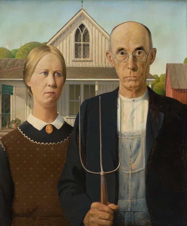
Get close and the first thing you notice is the verticality. The whole panel is run through with uprights that answer one another. The three tines of the pitchfork rise toward the man's face; the seams of his denim overalls drop straight down to echo those tines; the carpenter-gothic window in the white house behind the pair repeats the pointed shape a third time, smaller, in tracery. Grant Wood has built a picture where a farm tool, a man's clothes, a face and a piece of domestic architecture are all the same shape, and he wants you to catch the rhyme. The pitchfork is not a prop. It is the painting's grammar made visible.
Then the faces. The man looks straight out at us, his glasses two more hard verticals flanking the bridge of his nose, his expression set somewhere between defense and challenge. The woman beside him does not meet our eye. Her gaze slides off to the right, past the frame, toward something we cannot see, and that small refusal does most of the picture's psychological work. A loose curl has escaped the severe part in her hair. Wood paints the rickrack trim on her apron and the cameo brooch at her throat with the same dry, deliberate touch he gives the clapboard and the window, so that person and house are rendered as one continuous fabric. Nothing is brushy. Nothing dissolves. The surface is tight as a held breath.
The palette is as controlled as the drawing. Wood works in a narrow band of browns and bone-whites, broken only by the dull green of the man's shirt and the pinprick red of the brooch, so that color never competes with structure. Light falls evenly, almost without weather, the kind of flat midday clarity that keeps every edge sharp. There is no atmosphere to hide in. Each plane of the white house, each fold of the apron, each rib of the pitchfork is given the same even illumination, and the effect is of a world where nothing is allowed to blur or soften. You feel the maker's patience in it, the slow accumulation of small decisions, none of them improvised.
Wood reached national stature with this panel in 1930 (National Gallery of Art), and the country has been arguing ever since about whether it mocks its two figures or honors them. The painting itself stays out of that fight. It is too busy being well made. The pleasure of standing in front of it is not the pleasure of decoding a joke about rural America. It is the pleasure of watching a maker fit every element to every other element until the thing clicks shut.
What the one work teaches the many
Once your eye is tuned to that discipline, walk the rest of the museum and you keep finding it. Cross from the American galleries to the Old Master rooms and the rhyme-and-lock method is already there, centuries early, doing the same job with different furniture.
The Dutch and French still lifes
Look at the vanitas table by Evert Collier, whose title alone runs to a small inventory: candlestick, musical instruments, Dutch books, a writing set, an astrological and a terrestrial globe, an hourglass, all on a draped table. Collier was a Leiden specialist in exactly this kind of staged abundance, and the moral is conventional: time runs out, learning and music and worldly measurement all stop at the hourglass. What is not conventional is the organization. The objects are not piled. They are spaced, each given its own pool of light and its own slight diagonal, so that the eye is led from the open book to the bowl of the globe to the guttering candle without ever losing its footing. It is the same instinct as Wood's: assign every element a job, let nothing float free.
Now set beside it the still life by Louise Moillon, a basket of fruit and a bunch of asparagus. Moillon was one of the few women to build a real reputation in seventeenth-century French painting, and she did it on restraint. Where Collier crowds the table to make a sermon, Moillon empties it to make a fact. A few peaches, a basket, the pale green spears tied and laid down. The light is cool and even, the background plain, and the whole drama is in the weight of the fruit and the slight bruise of ripeness on the skin. Two pictures, two nations, one cabinet of the same impulse to make ordinary things hold still and be looked at hard.
Two interiors: van Gogh and Matisse
The Institute's Bedroom in Arles is the version most people half-remember, and it pushes the same lesson into color. Van Gogh tilts the floor up toward us so the whole little room rushes forward, the bed jammed into the corner, the two chairs, the pictures pinned crooked on the wall. He told his brother he wanted the picture to express rest, and the way he tries to force that is by pairing things off: two pillows, two chairs, two pictures, two doors, the bed answered by the table. Calm is built out of doubling. The perspective is impossible if you measure it, and completely persuasive if you simply stand there. The room holds because the rhymes hold.
Hang that beside Henri Matisse's Interior at Nice and the contrast sharpens the point. Matisse opens his room to the Mediterranean light, lets the patterned wallpaper and the louvered shutters and the window frame divide the canvas into bright rectangles, and lets the figure sit loosely inside that grid. He is not forcing rest. He is dissolving the room into decoration and trusting the architecture of the window to keep the picture from drifting. Van Gogh nails the room down with outline and complementary color. Matisse lets it breathe and relies on geometry. Same problem, opposite temperaments, and you only really see the difference once American Gothic has taught you to ask how a picture is held together in the first place.
Works discussed in this article
Nighthawks, and the loneliest geometry in the building
No work proves the thesis harder than Edward Hopper's Nighthawks. The diner is a single great wedge of plate glass thrust into a dark, empty street, and Hopper builds the whole mood from that one curved sheet of window. There is no visible door. The light is the green-yellow of fluorescent tubes, which in 1942 was new and faintly sinister, and it spills onto the sidewalk in flat geometric patches. Four figures, almost no contact between them, the counterman bent below the urns, a couple whose hands nearly touch and do not. The painting is as locked-down as American Gothic, only here the lock produces isolation instead of rectitude. The same toolkit, hard edges and answering shapes, turned to the opposite emotional end.
Notice how Hopper denies you an entrance. The glass curves away without a seam, the street outside is swept clean of detail, and the warm interior is sealed behind that uninterrupted pane. You are kept on the dark side of the window, a witness who cannot get in. The geometry that binds the four figures together is the same geometry that shuts them away from you, and that double duty is the whole quiet cruelty of the picture.
This is what I mean by one work teaching the many. Wood and Hopper were near contemporaries, both suspicious of European abstraction, both committed to a tight American realism. Put their two paintings in the same mental room and you can read off the entire range of what that realism could do, from the wry portrait frontality of the farm couple to the anonymous urban dread of the all-night counter. The Institute owns both. That is not luck. It is the result of a museum that decided early it would collect modern American painting seriously and stuck to the decision.
The European spine
The American pictures get the postcards, but they sit on top of a deep European foundation, and the museum's Impressionist and Post-Impressionist holdings are the reason scholars cross oceans for it. Georges Seurat painted his manifesto of Neo-Impressionism, A Sunday on La Grande Jatte, and it lives here, accession 1926.224 (The Met, Heilbrunn Timeline). Stand before it and the rhyming instinct returns in yet another dialect: every figure on the riverbank is built from the same patient dots of pure color, and the parasols, the curve of a bustle and the sail on the water all echo each other across a surface that is, on inspection, almost a diagram.
Two rooms over hangs Gustave Caillebotte's Paris Street; Rainy Day of 1877, a monumental view of a wet, modern boulevard intersection peopled by the new Parisian middle class (Smarthistory). Caillebotte's reputation has only risen lately; the 2024 to 2025 exhibition Gustave Caillebotte: Painting Men, organized with the Getty and the Musée d'Orsay, traveled to the Art Institute itself (The J. Paul Getty Museum). The museum is not a static vault. It keeps reframing its own collection through the loans it borrows and lends.
Reach back further and the academic and Old Master rooms hold their own. The collection carries multiple canvases by William-Adolphe Bouguereau, whose polished Salon nudes were once the most expensive pictures in Paris and were later treated as the enemy by every modernist in the building, and the Venetian energy of Jacopo Tintoretto, whose swirling figures argue the case for movement against everything Wood stands for. The academic line continues with Jules Lefebvre. A good museum keeps its arguments under one roof. Hang Bouguereau's seamless finish near van Gogh's loaded brush and the nineteenth century's whole quarrel about what paint should look like plays out in a single corridor of the Post-Impressionist wing.
An archive, counted
There is a way to measure how much of this museum a person can actually carry away, and our own corpus offers one. Artifact World Gallery holds 2,294 Art Institute of Chicago works, by 733 different hands, with the earliest objects dated to roughly the twelfth century and the latest to 1953. Set that against the museum's own count of close to 300,000 objects, and the gap tells the real story. What circulates, what gets reproduced and remembered and looked at, is a tiny, hard-working fraction of what the building stores. Eight hundred years of making, compressed by attention down to a few hundred faces. The 2,294 are the works that earned their way into general memory.
That compression is exactly why the single-work method is the right one for a museum this size. You will not see 300,000 things. You will not even see the 2,294. But you can see one painting properly, and a painting seen properly rearranges the others. Spend twenty minutes with the farm couple and the pitchfork, learn how Wood makes shape answer shape, and Collier's globes, Moillon's asparagus, van Gogh's doubled chairs, Hopper's curved glass and Seurat's dots all snap into the same conversation. The museum stops being a list and becomes a method.
Begin with American Gothic. Let the pitchfork show you the rhyme. Then walk out into the rest of the rooms and watch how often the same lock clicks shut, in Leiden and Arles and Nice and on a dark American street, and you will have learned to read the Art Institute the way it was built to be read.
Sources & further reading
- Art Institute of Chicago — Wikipedia
- Georges Seurat (1859-1891) and Neo-Impressionism — The Met, Heilbrunn Timeline of Art History
- Grant Wood — National Gallery of Art
- Gustave Caillebotte, Paris Street; Rainy Day — Smarthistory
- Catalogue of a Century of Progress Exhibition of Paintings and Sculpture — Internet Archive (Art Institute of Chicago, 1933)
- Gustave Caillebotte: Painting Men — The J. Paul Getty Museum