Artwork
Wendingen
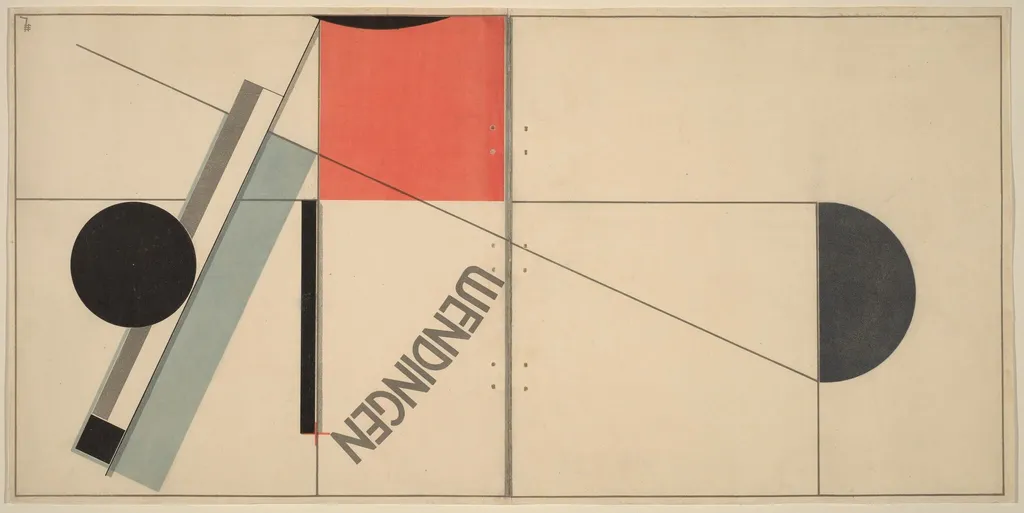
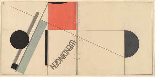
Wendingen is an ink print by El Lissitzky. It dates from 1921 and is held in the collection of the National Gallery of Art.
- Inscription
- Inscribed:lower right plate: EL; across top plate: WENDINGEN
About this work
Overview
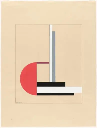
El Lissitzky’s 1921 lithograph served as the cover for the Dutch avant‑garde periodical Wendingen.
El Lissitzky’s 1921 lithograph served as the cover for the Dutch avant‑garde periodical Wendingen. The composition is a flat, geometric arrangement of stark forms: a dominant black circle on the left, a central red square, paired black crescents on the right, and a diagonal light‑blue rectangle that bisects the field. The title appears in irregular, slanted lettering, reinforcing the work’s kinetic feel.
Subject & Meaning
The cover does not depict a narrative scene; instead it visualises the magazine’s editorial ambition to challenge conventional aesthetics. By juxtaposing primary colors and contrasting shapes, Lissitzky creates a sense of tension and movement, suggesting the disruptive, forward‑looking spirit of the publication’s articles on modern art and architecture.
Technique & Style
Executed as a color lithograph, the image relies on separate stone or metal plates for each hue, allowing crisp edges and vivid saturation. The design reflects Lissitzky’s Constructivist leanings, employing abstraction, bold geometry, and asymmetrical balance, characteristics that align with the broader Russian avant‑garde’s emphasis on functional visual communication.
History & Provenance
Created in 1921, the lithograph was printed specifically for the inaugural issue of Wendingen, a Dutch magazine that ran from 1917 to 1938. Original copies of the periodical, including Lissitzky’s cover, are held in several European museum collections and remain reference points for studies of early twentieth‑century graphic design.
Context
The work emerged during a period of intense cross‑national exchange among European modernists. Lissitzky, a key figure in Russian Constructivism, was invited to contribute to the Dutch publication, illustrating the magazine’s role as a conduit for avant‑garde ideas across borders.
Artist & collection