The mood was manufactured
The Baroque period in art history is usually taught as a temperature. Students meet it as drama, theatricality, swelling emotion, the heat that arrives after the cool measure of the Renaissance. That description is true and nearly useless, because it names what the paintings feel like without explaining how anyone produced the feeling. This essay takes a harder line. The Baroque was made in the workshop before it was felt in the church, and its emotional charge is the visible residue of a few material decisions: a darker ground, a thinner upper paint, a candle in place of a window, a canvas wide enough to cover a wall. Change the method and the mood collapses.
My claim is plain. The recognizable Baroque look is a technology rather than a sentiment, and almost every famous effect can be traced to a choice made with a brush, a pigment, or a contract. The tenebrist gloom, the wet flash on a silver tankard, the figure that seems to tip out of the frame toward you, each is the outcome of a procedure a seventeenth-century painter could teach an apprentice in an afternoon. Read the period this way and the works in our collection stop being a parade of masterpieces. They become a record of solved problems, and the solutions are often more interesting than the saints. Hold that frame and a second thing follows. If the look is a technology, it can be exported, copied, and scaled, so the spread of the style across a continent stops being a mystery of zeitgeist and becomes a question of who trained with whom.
A word for a flawed pearl
The name arrived late and as an insult. It descends from the Portuguese barroco, a misshapen or irregular pearl, a jeweller's word for something the eye reads as wrong (Wikipedia, "Baroque"). It first hardened into a critical term about music, not painting: a 1734 notice in the Mercure de France mocked the novelty of Rameau's new opera as du barocque, complaining of music that would not settle into a tune. The insult stuck because it caught a real quality of the work, an off-balance, deliberately unresolved energy that the seventeenth century prized and the eighteenth came to mistrust. Only later did historians lift the slur and pin it to the visual art of the previous century. By then the thing it described had been finished for two generations.
Where and when that thing peaked is well agreed. Tate places the style's height in Rome between roughly 1630 and 1680 and ties it firmly to the Catholic Counter-Reformation (Tate, art term "Baroque"). The institutional engine sits behind that date. The Council of Trent, which closed in 1563, had instructed the Church to make sacred images clear, decorous, and emotionally direct, art that an unlettered worshipper could read and be moved by. The painters of the next century answered with a method built for exactly that brief. The word may mean a defective pearl, but the irregularity was engineered.
Smarthistory frames the same development as a deliberate sensory strategy, images meant to overwhelm a viewer's resistance rather than merely instruct it (Smarthistory, "Baroque"). The means were physical. A worshipper standing before a darkened altarpiece is not reading a text. The painter is staging an ambush of the eye, and the equipment for that ambush is nothing more exotic than pigment, ground, and a clear idea of where the one strong light will fall.
The dark ground and the candle
Begin with the most legible Baroque technique, the one a child can name: a bright thing emerging from blackness. Painters called the approach tenebrism, from the Italian for darkness, and it starts not with light but with the ground. A painter in the Caravaggesque line primed the canvas with a dark, often reddish-brown imprimatura, then let that darkness stand as the deepest shadow of the finished picture. The crucial point is procedural. You do not paint the dark. You reserve it. Light is built upward in thicker, paler paint, so the brightest passages sit physically higher on the surface than the gloom they interrupt. Think of it as negative painting. The artist spends the first hours of the picture deciding what to leave alone, and the drama is a consequence of the layering order, fixed before a single figure is drawn.
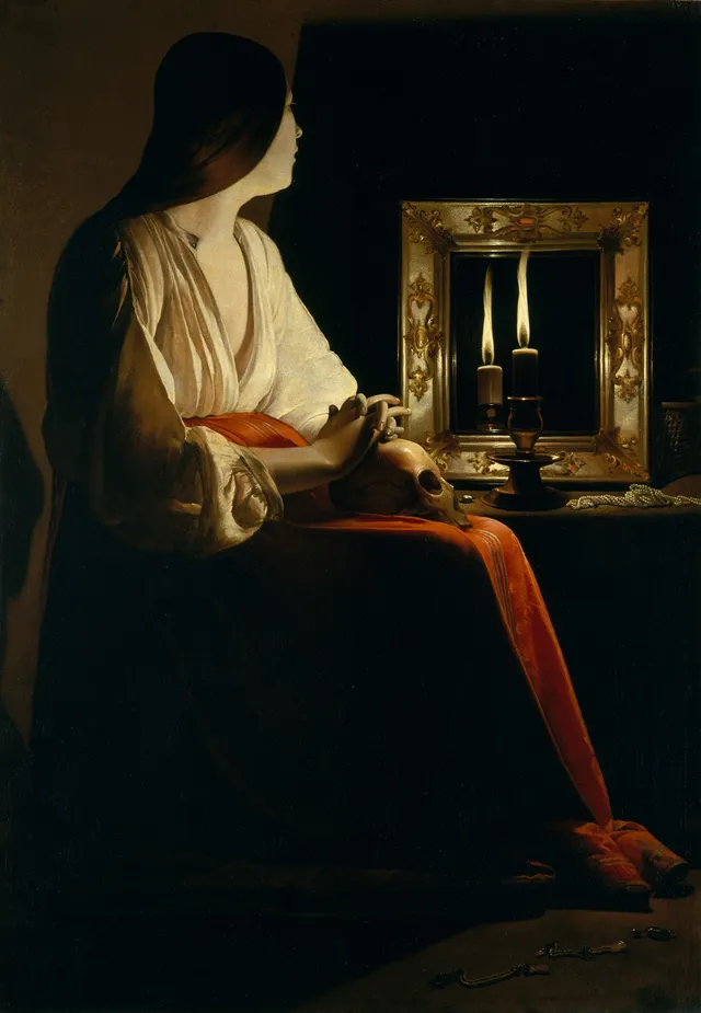
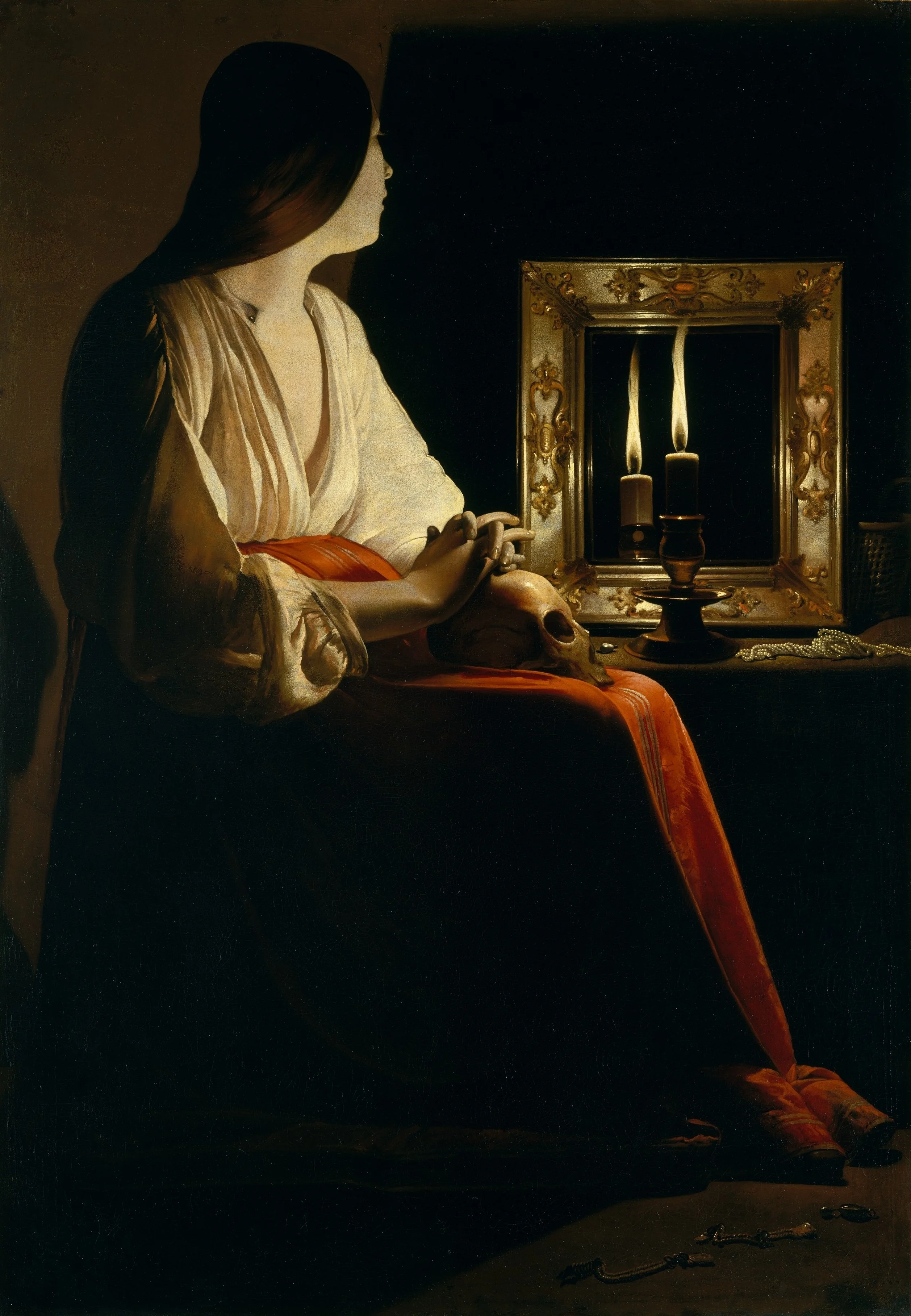
Look at The Penitent Magdalen. A young woman sits at a bare table in near-total darkness. One candle burns near a skull, and its flame is the only event in the upper half of the canvas. Georges de La Tour gives you that flame again in a mirror, so the picture's single light source reads as two, and the warm color climbs the woman's cheek, the bridge of her nose, the tendons of her interlaced fingers where they rest against the skull. The shadowed half of her face is not modelled so much as withheld, and your eye fills it in. Everything else falls to brown and black. The skull is not spotlit; it sits in shadow, its dome catching just enough glow to register as bone. No landscape, no architecture, no allegorical crowd. The whole effect runs on how little is shown and how precisely the few lit edges are placed.
This is the Counter-Reformation lesson delivered as a lighting diagram. A single candle forces a single moral focus and lets the painter discard the inventory of props an earlier altarpiece would have required. La Tour runs the same device in The Repentant Magdalen, another flame, another mirror, another skull, the composition rebuilt around the physics of one light in one dark room. The repetition is the giveaway. A mood you can reproduce on demand is not a mood. It is a recipe, and La Tour had the recipe written down.
Building a banquet out of glazes
Move north, into a Protestant republic with no altars to fill, and the same material intelligence turns to a tabletop. Dutch still life of the mid-century looks effortless and is anything but. Take Banquet Piece with Mince Pie by Willem Claesz Heda. A white cloth has been pulled and rucked across a table whose front edge tilts up toward us. A pewter plate juts out over that edge, defying its own weight. A tall wine glass stands beside a toppled silver tazza, a lemon trails its peel in a spiral, and the pie sits broken open, already eaten from. The disorder is staged. A meal abandoned mid-bite is a small sermon on appetite and time, though Heda never lets the moral overpower the optics. The color is held to a narrow band of grey, ochre, and cold green, the tonal scheme Dutch painters called the banketje, or little banquet.
The restraint is what makes the surfaces convincing, and the surfaces are a technical performance. Heda renders metal and glass by stacking transparent glazes over an opaque grey underpaint, so the reflection seems to live inside the object rather than on it. The final move is a single loaded touch of near-white at the rim of the glass or the lip of the tankard, paint laid on thick at the last second, sitting proud of everything beneath it. That one raised dot is the whole illusion of polish. Cover it and the silver dies. This is why these pictures reward standing close. From across a room the metal simply gleams; up close you can find the exact dab of lead white that does the gleaming, a single deliberate stroke pretending to be a reflection. The lesson of the still-life shop is the same as the candlelit one: keep the field quiet, then place the bright accent with a jeweller's precision. Specialists such as Peter Binoit built whole careers on that single discipline of restraint and accent.
The workshop was a factory
None of this scaled by accident. The Baroque is also a story about the size of the canvas and the structure of the business behind it. Sculpture makes the point fastest. Gian Lorenzo Bernini, the Roman whom the Getty credits with inventing Baroque art outright, rebuilt the portrait bust into a thing that turns, breathes, and seems caught mid-sentence (J. Paul Getty Museum, Bernini). That liveliness was a production method as much as a gift. Bernini ran a large studio of carvers and assistants, blocking out marble in stages and reserving the final breathing surface for his own chisel, the way a painter reserved the dark and saved the highlight for last. The genius is real, but it is genius organised into a workflow.
Painting industrialized the same impulse. When Rembrandt finished the militia portrait now called The Night Watch in 1642, he refused the static row of paying sitters his clients expected and showed the company in the act of forming up, the captain stepping forward to order the march while the guardsmen scramble into rank (Rijksmuseum, The Night Watch). Motion at that scale demands a canvas you cannot paint alone, and it demands a workshop that can prepare grounds, grind pigment, and lay in backgrounds while the master concentrates on the faces. The theatrical Baroque composition and the large collaborative studio are the same fact seen from two sides.
Seville ran on the identical model. Bartolomé Esteban Murillo kept a productive shop turning out devotional pictures for a city hungry for them, and his secular work shows the same trained ease. In Two Women at a Window, a young woman leans on a sill into the light while an older one half-hides behind a shutter, stifling a laugh in her shawl. The whole picture is built from one decision about a light source falling across a threshold, the bright faces forward, the room behind dropped to shadow. The tenebrist diagram again, warmed up and turned to flirtation instead of penitence.
Light measured as architecture
There is a quieter strand of the period where the method shows even more nakedly, because the subject is light itself. Emanuel de Witte painted the insides of Dutch churches stripped of their old imagery by the Reformation, which left him a problem of pure construction. Strip a church of its pictures and the building itself becomes the subject, and de Witte treats that emptiness as an opportunity rather than a loss. In The Interior of the Oude Kerk, Amsterdam, whitewashed piers march back along a measured perspective, and daylight rakes across them from high windows, pooling on the floor and grazing the columns so that each one reads as round. With no saints to carry the meaning, the meaning is the light, plotted as carefully as the orthogonals. De Witte is doing geometry and atmosphere at once, and you can sense the ruled vanishing lines under the glow.
The optical obsession reaches its strangest point with Johannes Vermeer. Most of his surviving work is silent domestic light, but the Allegory of the Catholic Faith turns the same optical care toward an explicit program, a figure of Faith with foot on a globe, a glass sphere hung overhead, a length of patterned cloth drawn aside like a stage curtain. Whatever one thinks of the iconography, the handling is the familiar Vermeer apparatus: a controlled fall of light, soft beads of highlight on the sphere and the chalice, a tonal hush. He builds the chalice's shine the way Heda builds his tankard's, a small bright bead set down last onto a carefully dulled ground, the same trick travelling from one studio to another. Even when he was painting doctrine, he was painting the behavior of light through a lens. The Baroque north and south share that root. Both are studios that learned to treat illumination as a buildable material.
Works discussed in this article
What the spread of the work tells you
The scale of the enterprise is easy to underrate from a single gallery wall. Artifact World Gallery holds 27,995 Baroque works, made by 2,924 artists and now scattered across 178 venues, the bulk of them falling between 1600 and 1699. That distribution is itself an argument. Almost three thousand recorded hands is not the signature of a handful of geniuses with a mysterious gift. It is the footprint of a trade with shared procedures, a body of craftsmen who could all prime a dark ground, reserve a shadow, stack a glaze, and save the highlight for last, because those were transmissible skills rather than private secrets. The National Gallery of Art's survey of the period stresses the same split our archive shows in miniature, a Catholic south of altarpieces against a Protestant north of domestic and civic subjects (National Gallery of Art, "Baroque"). The style spread because the method could be taught, and it bent to whatever a given market would pay for.
Set the period beside the one it grew out of and the technical break is sharp. The Renaissance had idealized a balanced, evenly lit, frontally legible world. The Baroque tilted the table, killed the ambient light, pushed figures past the picture plane, and let darkness do half the composing. Heinrich Wölfflin, writing in the nineteenth century, was the first to argue this as a formal grammar rather than a decline, and his categories still shape how the change gets described. The point that survives him is the one this essay has pressed: the grammar was material first. Painterly over linear, recessive over planar, these are not adjectives about feeling. They are descriptions of where the paint sits and how the light was built.
So the next time a Baroque picture grabs you across a room, resist the word drama for a moment and ask the workshop question instead. Where is the dark, and was it painted or reserved? Where is the single brightest touch, and how late was it laid down? Whose hands prepared the ground before the master arrived? Answer those and you are no longer admiring a mood. You are reading the instructions, and the instructions, four centuries on, still run.
Sources & further reading
- Baroque (art term) — Tate
- Baroque — Wikipedia
- The Night Watch (Militia Company of District II) — Rijksmuseum
- Bernini — The J. Paul Getty Museum
- Baroque Rome (Heilbrunn Timeline of Art History) — The Metropolitan Museum of Art
- Baroque (period, culture, style) — Smarthistory
- Baroque — National Gallery of Art
- Renaissance and Baroque (trans. Kathrin Simon) — Internet Archive