The Baroque movement was a picture-making system built for viewers who already knew how to read it. A seventeenth-century parishioner kneeling before an altarpiece, a Haarlem merchant pricing a breakfast still life, a Roman cardinal pacing his gallery: each came to the picture carrying a working code of saints, attributes, proverbs, and warnings. The paintings spoke straight into that literacy. They were arguments, instructions, and memorials dressed as spectacle, and the first thing any of them did was mean something specific to somebody specific.
This essay takes a position that cuts against the textbook reflex of describing the Baroque chiefly by its surface energy. We are trained to see motion, diagonal thrust, and stagecraft lighting, the vocabulary Heinrich Wölfflin fixed in place a century ago. That drama is real and it is sometimes magnificent. But it was the delivery, not the message. What actually held a Baroque painting together for the people who first stood in front of it was iconography: the disciplined assignment of meaning to objects, hands, glances, and light. Recover that grammar and the Baroque stops looking like a style of excess and starts working as a style of address. Lose it, as most modern looking has, and we end up admiring the rhetoric while missing the sentence underneath.
Reading by candlelight
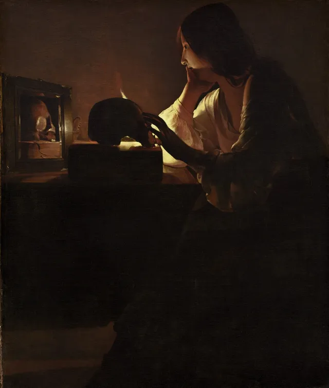
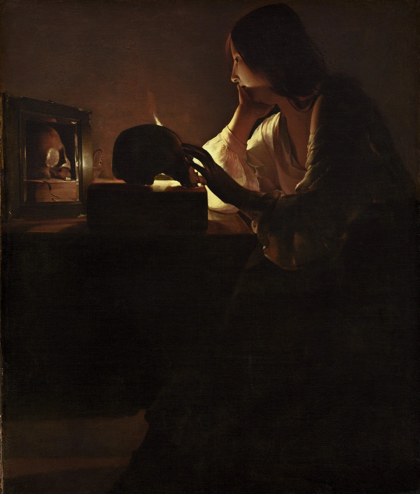
Start with one picture and look hard. In The Repentant Magdalen by Georges de La Tour, a young woman sits in near-total darkness, her body turned three-quarters away from us, one hand laid flat on a skull that rests in her lap. A single candle burns on the table at the left. La Tour gives it to us twice: once as the bare flame, and again as its reflection inside a tall mirror, so the light seems to breathe in two places at once. The mirror is the loudest object in the room and it shows almost nothing, only the candle and a smear of warm dark. Scattered near it lie a string of pearls and a length of gold chain, dropped, not arranged, the jewelry of a life she is in the act of setting down. Her face is calm and unreadable, lit along one cheek, the rest of her dissolved into brown shadow that La Tour lays on in broad, smooth, almost matte planes. The brushwork is part of the discipline. He suppresses incident, refuses the glint and bustle a Dutch painter would have lavished on these same props, and reduces the picture to a few large shapes meeting in the dark.
Now read it. The skull under her hand is not a prop for mood; it is the memento mori, the reminder that the flesh ends, and her palm rests on it the way you would rest a hand on something you have accepted. The discarded pearls are the vanity of the world, refused. The mirror, an old attribute of vanity and self-regard, has been turned inside out: it reflects not her beauty but a flame, the standard emblem of a soul, brief and exposed and consumable. The candle measures time the way an hourglass would. To La Tour's first audience, devout French Catholics in the 1630s and 1640s, none of this needed a caption. They saw a woman doing the most serious thing a person could do, weighing her own death and choosing God over her own face in the glass. The quietness is the argument. La Tour has stripped the scene of every distraction so the symbols can be heard one at a time.
That is the move this whole essay is built on. A modern viewer can love the painting for its hush and its handling of light and still walk away thinking it is a study of a pretty woman by a candle. The original viewer received a sermon on penitence, conversion, and the worthlessness of worldly goods, delivered without a single word. The picture assumes you can read; the reading was the point of buying it.
The Counter-Reformation's instructions
The reason so many Baroque pictures behave like coded instructions is that a large share of them were commissioned to do exactly that. The style reached its height in Rome roughly between 1630 and 1680, and it was bound up from the start with the Catholic Counter-Reformation, the Church's long answer to Protestant criticism (Tate). Protestants had attacked religious images as idolatry and emptied many of their churches of art. Rome's response was not retreat but escalation: art was to be more vivid, more legible, and more emotionally direct, so that an ordinary worshipper could grasp doctrine and feel it in the body. Seventeenth-century Rome became the acknowledged capital of the European art world, the city where Gian Lorenzo Bernini, Francesco Borromini, and Pietro da Cortona set the terms that painters and architects elsewhere either followed or pushed against (The Met).
What this produced, again and again, was a painting designed to put the viewer inside the event. A martyr looks out of the canvas and meets your eye. A saint's vision spills toward the picture plane so that the miracle appears to be happening in your space, not in a sealed past. The diagonal compositions and raking light that Wölfflin catalogued as formal traits were, in their first setting, tools of persuasion. They aimed the viewer's attention, told the eye where to enter and how to move, and timed the emotional payoff. This is also why the figures so often crowd the front edge of the canvas. Pushing the holy event forward, almost into the viewer's lap, collapsed the distance between the worshipper and the sacred history on show, and turned doctrine into something closer to a summons than a record. The drama was a means of instruction. You were meant to leave the chapel having understood a specific point of theology and having felt the cost of it.
The attributes that carry this freight were a settled language, learned the way a churchgoer learned the calendar of feast days. A few of the most common:
- Skull or extinguished candle, death, the brevity of life, the call to repent while there is time.
- Keys, Saint Peter, and with him the authority of the Church to bind and loose.
- Lily, purity, carried by the angel Gabriel and by virgin saints.
- Pearls and mirrors, worldly vanity, usually shown to be renounced or doomed.
- Palm frond, martyrdom, victory won through death.
A different audience, a different code
Travel north and the audience changes, so the iconography changes with it. The Dutch Republic was Protestant and commercial, and its painters mostly worked for an open market of private buyers rather than for the Church. Out of that market came the great secular genres, and they carried their own coded meanings. Consider the Banquet Piece with Mince Pie by Willem Claesz Heda. On its face it is an inventory of comfortable things: a half-eaten pie, a tipped silver tazza, a lemon peeled in one curling ribbon, a tall glass catching grey window light. Heda paints it in a restrained palette of pewter, oyster-white, and brown, with a connoisseur's love of how light slides off metal versus how it sinks into bread.
A Dutch buyer read more than appetite here. The overturned glass and the disordered table are the language of transience: the meal is interrupted, the feast already passing. The lemon, beautiful and bright, is sour inside, the standard emblem of pleasures that look better than they taste. The expensive tazza lying on its side is wealth shown to be unstable. There is a class reading folded in as well. The silver, the imported lemon, and the Venetian glass announce a household that has arrived, and the painting lets that pride sit beside the reminder that none of it lasts. These breakfast pieces are quiet cousins of the explicit vanitas, the skull-and-hourglass still life, and they let a prosperous household enjoy its own abundance while also nodding, soberly, to the limits of that abundance. The picture flatters and warns in the same breath. That double address, pleasure plus caution, is exactly the kind of meaning a survey that only describes Heda's brushwork will miss.
The same coded looking governs other Dutch genres in our holdings. The Interior of the Oude Kerk, Amsterdam by Emanuel de Witte is, on the surface, a feat of perspective: whitewashed Gothic columns marching back into cool light, a dog wandering the nave, a few small figures dwarfed by the architecture. But a Protestant church interior was itself an argument. The bare walls, scrubbed of the old Catholic images, declared a theology of the plain word over the painted icon, and de Witte's grave, depopulated spaces register that change as mood. A Bartolomé Esteban Murillo genre scene like Two Women at a Window plays the opposite game from the Catholic south: a young woman leans on a sill while an older one half-hides behind the shutter, smiling. To a contemporary eye the window, the laughter, and the watchful chaperone read as a knowing picture about courtship and reputation, the kind of scene that lets a viewer enjoy the flirtation and judge it at once.
What the archive shows
Step back from individual pictures and the scale of this meaning-making becomes its own argument. Across Artifact World Gallery, 15,170 works carry the Baroque tag, made by 2,427 named hands and now dispersed across 75 collecting venues, with attached dates running from roughly 1350 to 1977. The early and late edges of that span are instructive. The Getty's reference thesaurus dates the Baroque proper to about 1590 through 1750 (further reading below), yet our records reach centuries on either side, because so much of what we call Baroque is a way of reading rather than a clean calendar window. Devotional and emblematic objects from before 1590 feed the style its grammar, and later revivals keep speaking its dialect of saints and symbols long after the period closed. The corpus, in other words, behaves the way the iconography does: it spills past the dates because the visual code outlived the moment that produced it. Seventy-five venues is also a claim about reach. These are works that drifted out of their original chapels and dining rooms into museums on several continents, and the symbols still function once you know them, even stripped of the altar or the merchant's wall they were made for.
Two further works in our holdings show how wide the Baroque's address could spread. The Procession of Gondolas in the Bacino di San Marco by Antonio Joli reads at first as a pure view of Venice, all glittering water and crowded barges. But a Venetian ceremonial procession was a piece of civic theology: the city staging its own marriage to the sea, its wealth and its piety performed as one event for the benefit of citizens and visiting dignitaries. The painting records a meaning the city assigned to itself. And The Ark by Lodewijk Tieling takes a single biblical episode that every viewer knew by heart and asks them to read it as a promise of deliverance through judgment. The Baroque was an art-historical period that began in Europe but turned up across much of the globe, in forms as far apart as Spanish polychrome sculpture and Bernini's theatrical chapel designs (Smarthistory). What traveled with it was not only the look but the assumption that a picture is something you decode.
Works discussed in this article
The drama was never the point
It is worth being precise about where Wölfflin still helps and where he stops. His formal pairs, linear against painterly, closed against open form, are genuinely useful for describing how a Baroque surface is organized, and no serious account of the period can ignore them. The trouble starts when the formal description becomes the whole explanation, because it leaves the impression that Baroque painters chased movement and contrast for their own sake. They did not. They reached for those devices because a group portrait, an altarpiece, or a still life had a job to do, and the job was to make a particular audience understand and feel a particular thing. Description tells you what is there; iconography tells you why it is there, and only the second question explains the choices the first one catalogues.
Rembrandt's civic-guard portrait of 1642, the canvas we now call the Night Watch, makes the case cleanly. Its swirling diagonals and pools of light are the textbook signature of Baroque form. But the radical stroke was about meaning, not motion: Rembrandt was the first to paint a group-portrait company actually doing something, marching out rather than lining up for the camera, so that a set of men who had each paid for an equal share of the picture became actors in a single dramatized event (Rijksmuseum). The drama is in service of an idea about civic identity, the company as a living body rather than a row of paying customers. Form follows the meaning, never the other way around.
So the revised way to look is also the older way, the way the first viewers looked. Slow down in front of a Baroque picture and ask what each object is claiming before asking how the light is handled. Find the skull, the lemon, the dropped pearl, the lily, the empty whitewashed wall, and let it tell you who the painting was made for and what it wanted that person to carry home. Do that with La Tour's Magdalen and the candle stops being a lighting effect and becomes a soul, measured against a skull, in a room where a woman has just decided how she will die. The Baroque kept its meanings on the surface, in plain objects, waiting for a reader. The pictures are still talking. We mostly stopped listening, and the work now is to learn the language again, object by object, until the gallery turns back into the conversation it was built to be.
Sources & further reading
- Baroque (art term) — Tate
- Baroque Rome — The Metropolitan Museum of Art, Heilbrunn Timeline of Art History
- The Night Watch, Rembrandt van Rijn, 1642 — Rijksmuseum
- A beginner's guide to Baroque art — Smarthistory
- Baroque (style and period, c. 1590-1750) — Getty Research Institute, Art & Architecture Thesaurus
- Baroque — Wikipedia
- Principles of Art History: The Problem of the Development of Style in Later Art — Heinrich Wölfflin (Internet Archive)